Trend Proposals
Seasonal directions, edited for modern fabric storytelling.
Explore curated seasonal proposals across kids and teen collections — from master direction boards to hero products and final merchandising stories.
A living space for seasonal color palettes, print directions, trend notes, fair updates, and new creative signals from THE HOUSE.
Explore curated seasonal proposals across kids and teen collections — from master direction boards to hero products and final merchandising stories.
A curated view of soft seasonal tones, balanced color stories, and mood-led palettes shaping the next creative direction.
A gentle blend of muted pastels, warm neutrals, and soft contrasts shaped for a calm seasonal mood.
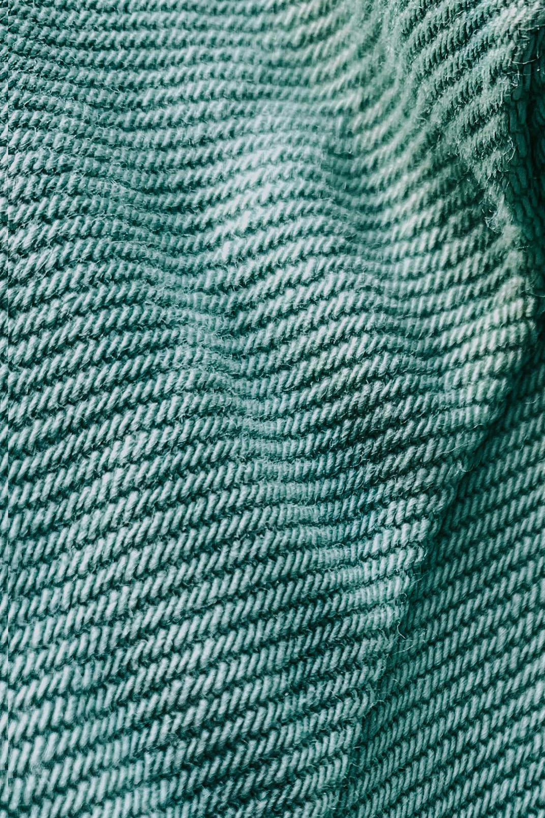
A grounded composition of soft earthy tones, muted greens, and calm neutrals built for a balanced visual mood.
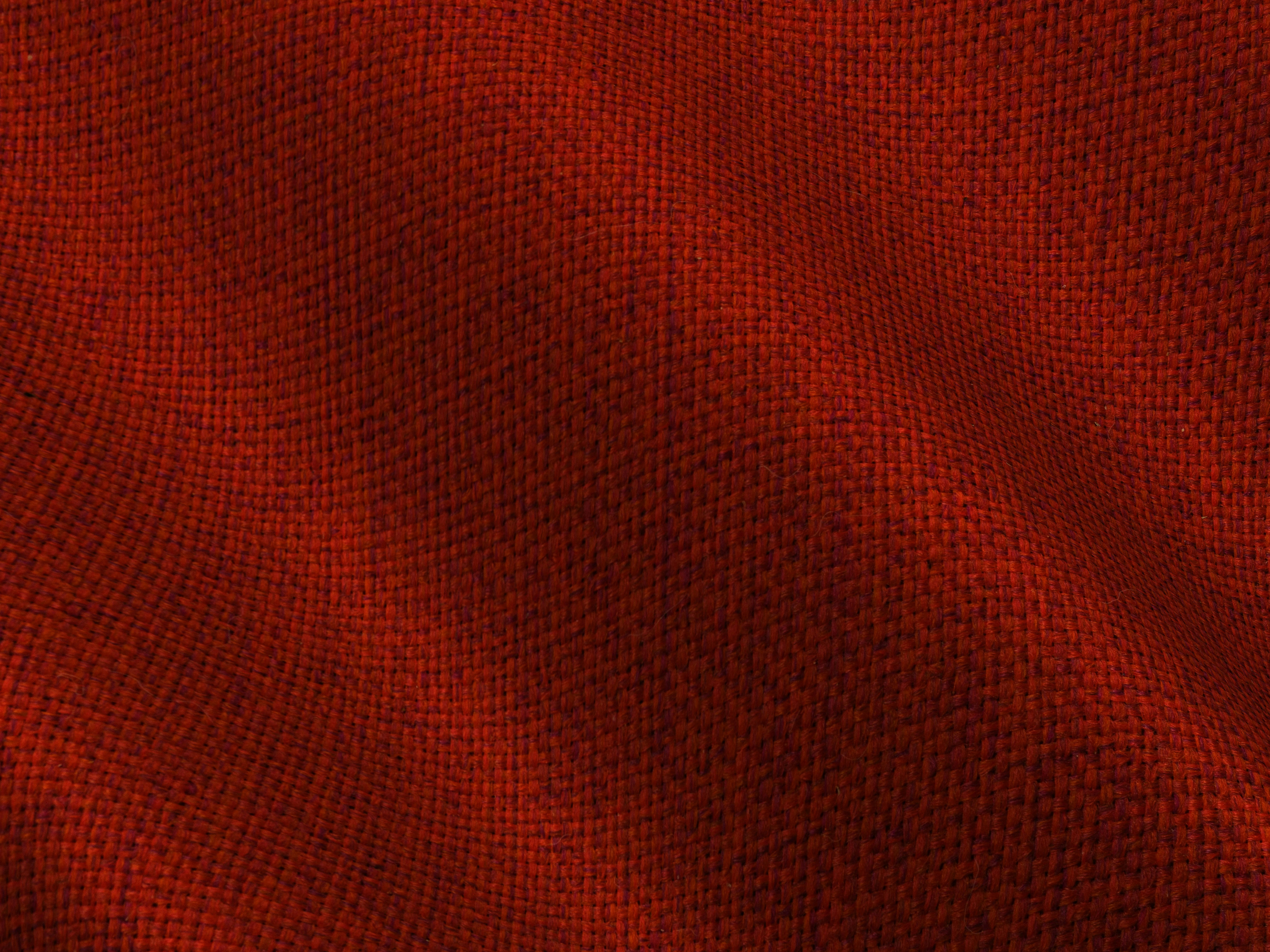
A warmer palette built with dusty rose, muted clay, soft cream, and quiet depth for a more emotional seasonal tone.

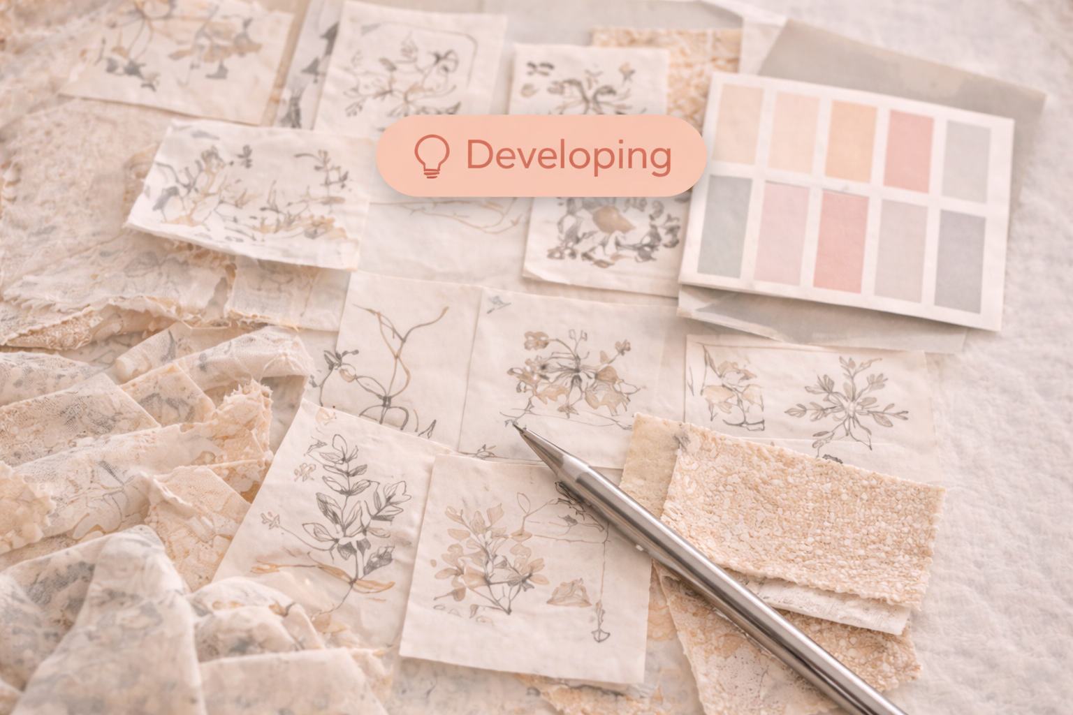
A focused space for surface direction, print moods, motif balance, and pattern signals shaping upcoming collections.
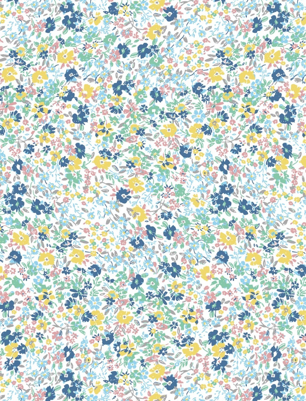
A calm floral rhythm built with breathing space, soft scale transitions, and a light romantic touch.
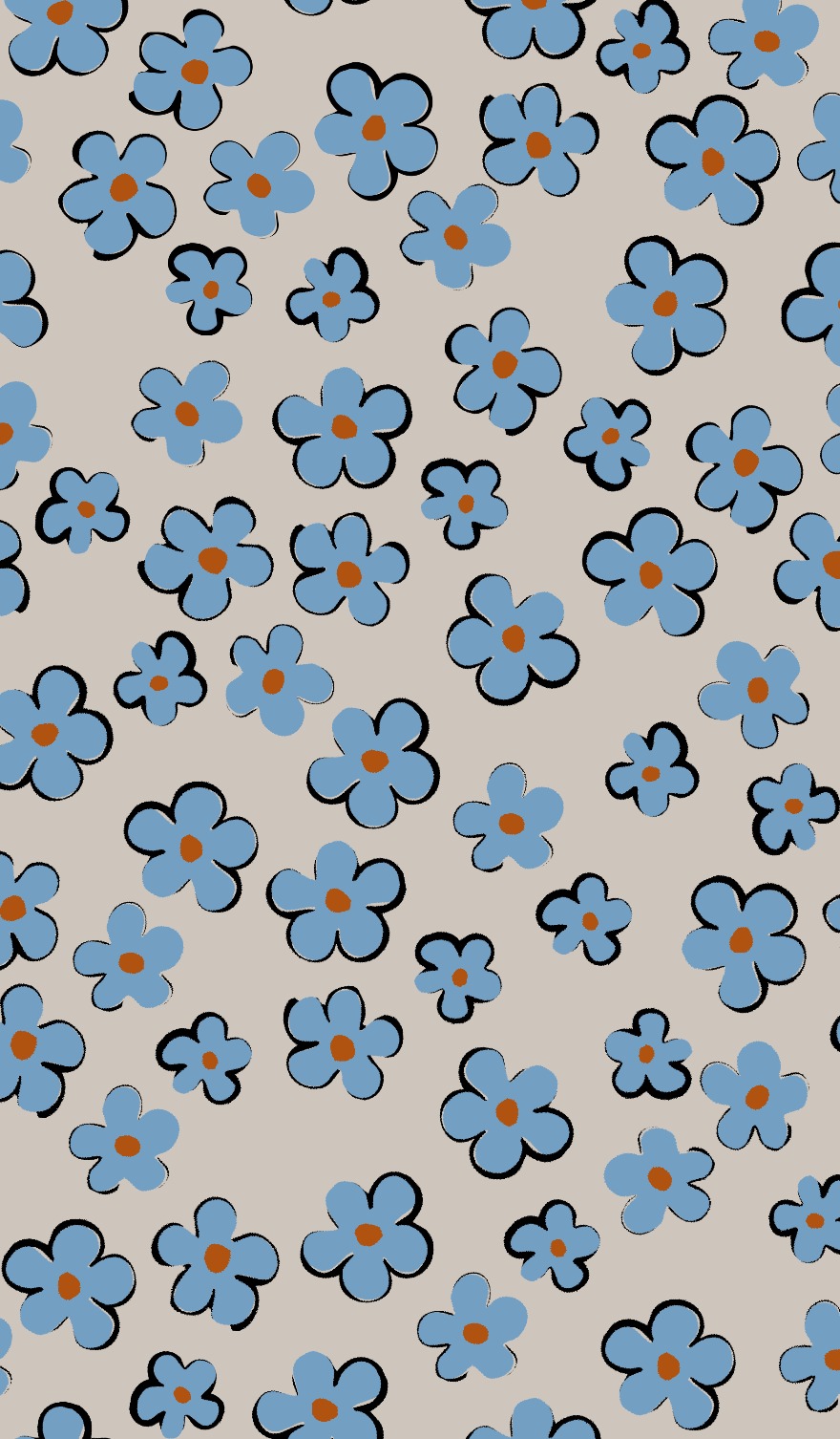
Small-scale conversational motifs shaped for balance, movement, and a cleaner modern surface language.
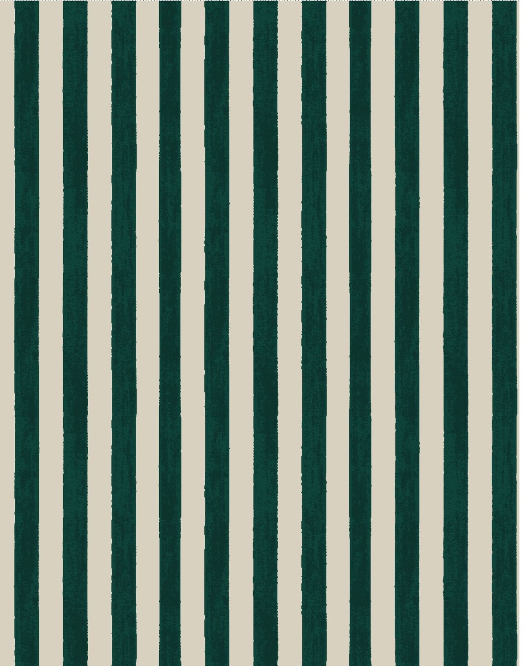
A softer striped direction with gentle spacing, quiet contrast, and a more refined everyday rhythm.
A space for concise notes on color mood, fabric feeling, visual direction, and the small shifts that shape future drops.
Calmer palettes and tender textures are no longer accents; they are becoming the foundation of the visual story.
Buttons, trims, collars, topstitching, and finishing choices are carrying more emotional weight than before.
Muted combinations and gentle contrasts are beginning to feel more lasting than louder trend-led palettes.
A concise view of where the studio is heading next, what is approaching, and which moments are worth watching.

A space to track relevant color, fabric, and directional signals gathered around the upcoming fair cycle.

The next seasonal palette study will expand with softer contrasts, grounded neutrals, and warmer balance.
New print directions are being shaped around quieter florals, miniature motifs, and softer repeat logic.
For collection conversations, palette discussions, print development, and future-facing sourcing ideas, get in touch with THE HOUSE.
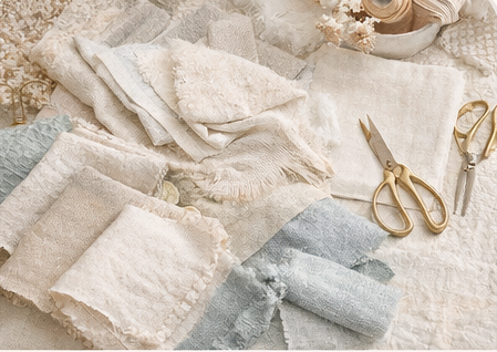
Contact The HouseA closer look at evolving fabric directions, where softer textures, muted tones, and tactile surfaces are becoming more dominant across kidswear and casual categories.
This shift signals a move toward calmer, more refined collections where material quality, subtle structure, and tonal harmony take priority over bold visual statements.
A preview of the next seasonal palette study, building on softer contrasts, grounded neutrals, and warmer tonal balance.
These signals suggest a calmer direction with more versatile color stories that can support both essentials and statement pieces across future collections.
A closer look at evolving print ideas, where quieter florals, miniature motifs, and softer repeat structures are beginning to take shape.
This direction points to more delicate, wearable pattern languages that feel timeless, versatile, and easier to translate across kidswear categories.
Request a Curated Edit